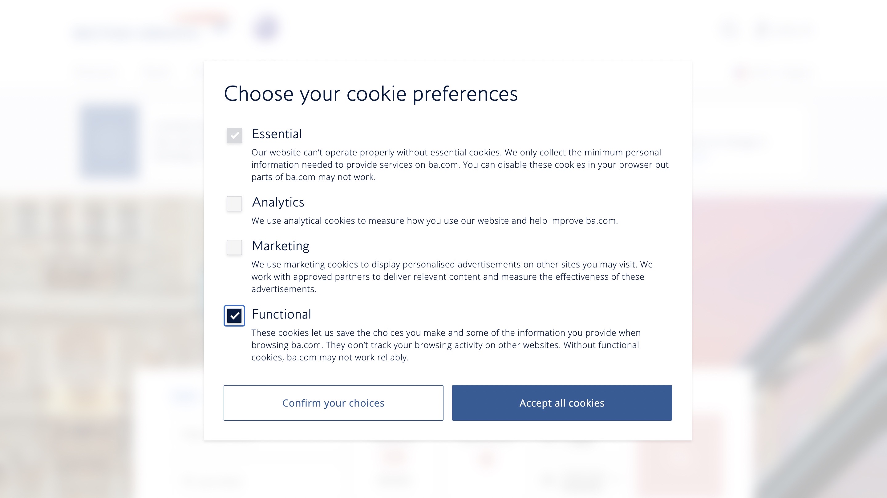
- From the design industry, this is an example of a dark pattern on the web
Context
To understand the example I’ve clipped above, let’s pay attention to the buttons. When designing, you’ll often design your components with variants.
Examples of components:
- Button
- Progress loader
- Snackbar
Examples of variants:
- Primary
- Secondary
So when you put the two together, it means your design file can contain the following:
- Primary Button, Secondary Button
- Primary Progress Loader, Secondary Progress loader
- Same thing for the snackbar
Differences between a primary & secondary button
There are a couple of styles that are used in design to establish hierarchy. listed below
- Font size
- Bold text vs regular text
- Color
- Borders
Good visual hierarchy is what allows you (person browsing the internet) to instinctively navigate around the site, it highlights the important bits.
Refactoring UI has a whole chapter named “Hierarchy is everything".
Visual hierarchy refers to how important the elements in an interface appear in relation to one another
So, a primary button is usually brighter & bolder than a secondary or tertiary button.
Psychology plays in too
Humans adapt. The brain is lazy. A lot of what we do is decided by the subconscious brain. It’s no different when browsing the internet or using your phone.
Tying it all together
Right, now back to the image I clipped above.
I mostly opt out of marketing, targeting, & analytics cookies etc. anything that raises privacy concerns, & I like to think you’re the same too, but the primary button on that modal is not really in your best interest. Pushing all cookies (including functionally unnecessary ones) onto you.
“Accept All Cookies” is the primary button, the button you’re more likely to subconsciously click.
You’re more likely to click that because
- The subconscious plays a big role when you’re using digital products. As you’re going through user flows, if they’re designed well, you should just breeze through the different screens without feeling too confused.
- If you assume positive intent, you’d expect that the primary action (what to do about the cookies) is in your best interest(to customise)
- And to quote Kapil:
“I’d even go on to say, the usually safer button or our go to button that we normally would click is always placed on the right”
this is basically what they’re doing
It’s predatory, & subtle, that’s my beef with it. rant over😂