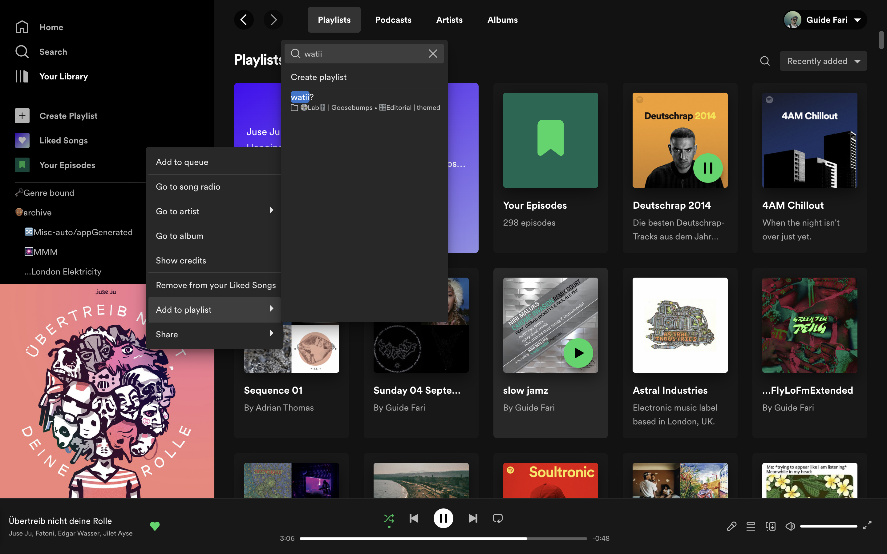
Desktop UX
1. Search for playlist when adding new track
I’d like to start this on a high note, celebrating a big quality of life UX item that was recently shipped.
The Ability to search for a playlist when adding a new track. This first shipped to mobile, and made for easier curating on the phone. Means I didn’t have to organise my playlists in a hierarchy of folders so much anymore, and could just rely on search to quickly find the playlist I need to add to. Quite handy when handling ~300 playlists :)

- The search is kind of fuzzy too! Another little nice to have
Fuzzy searches are also used for Structured Query Language lookups to help database users find records without having to be sure of the exact spelling of the value they’re looking for. src
1.1 Focus Context
- I right click, use the mouse to navigate the menu
- switch to keyboard to search for the playlist I want to add the track to
- because I’m still on the keyboard, it’s quicker for me to use the arrow keys to highlight and select the playlist I want after searching as opposed to the trackpad/mouse
But there’s a problem, the keyboard’s context is a step behind. In terms of UI position,the element that’s currently got focus.
What follows upon using the arrow keys instead of mouse, is it then closes the Add to playlist sub-menu, instead of navigating within it, which is what I intuitively expected
I’d expect to be able to pick up with the keyboard where my mouse left off.
Reminds me of an article about modal dismissal: Accidental Dismissal of Overlays: A Common Mobile Usability Problem