This commentary is guided by general UX heuristics I’ve picked up over the years.
Group related information

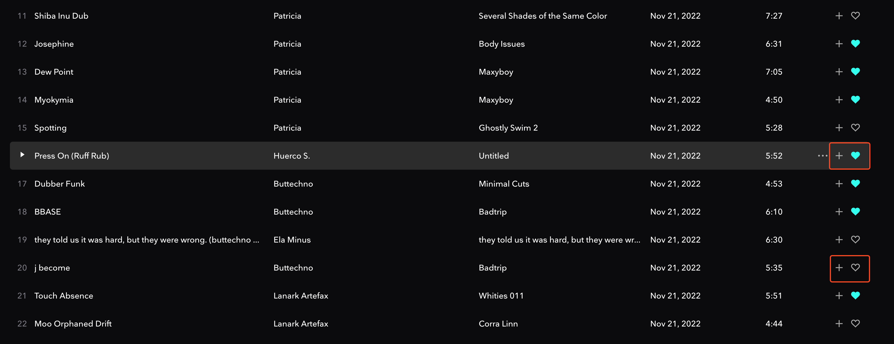
- When in a playlist, it’s a common workflow while curating to like & unlike tracks.
- With the way the
likeindicator is positioned in relation to the track name means my eyes have to do a massive horizontal scan, and hope like hell I am matching the rightheartto the right track. - Lots of back and forth with the eyes, can be exhausting & frustrating
- Fortunately, you can hover over the track so that the whole row gets highlighted - but that still doesn’t save the eyes from that constant horizontal back and forth.
- To learn more, check out Visual Hierarchy.
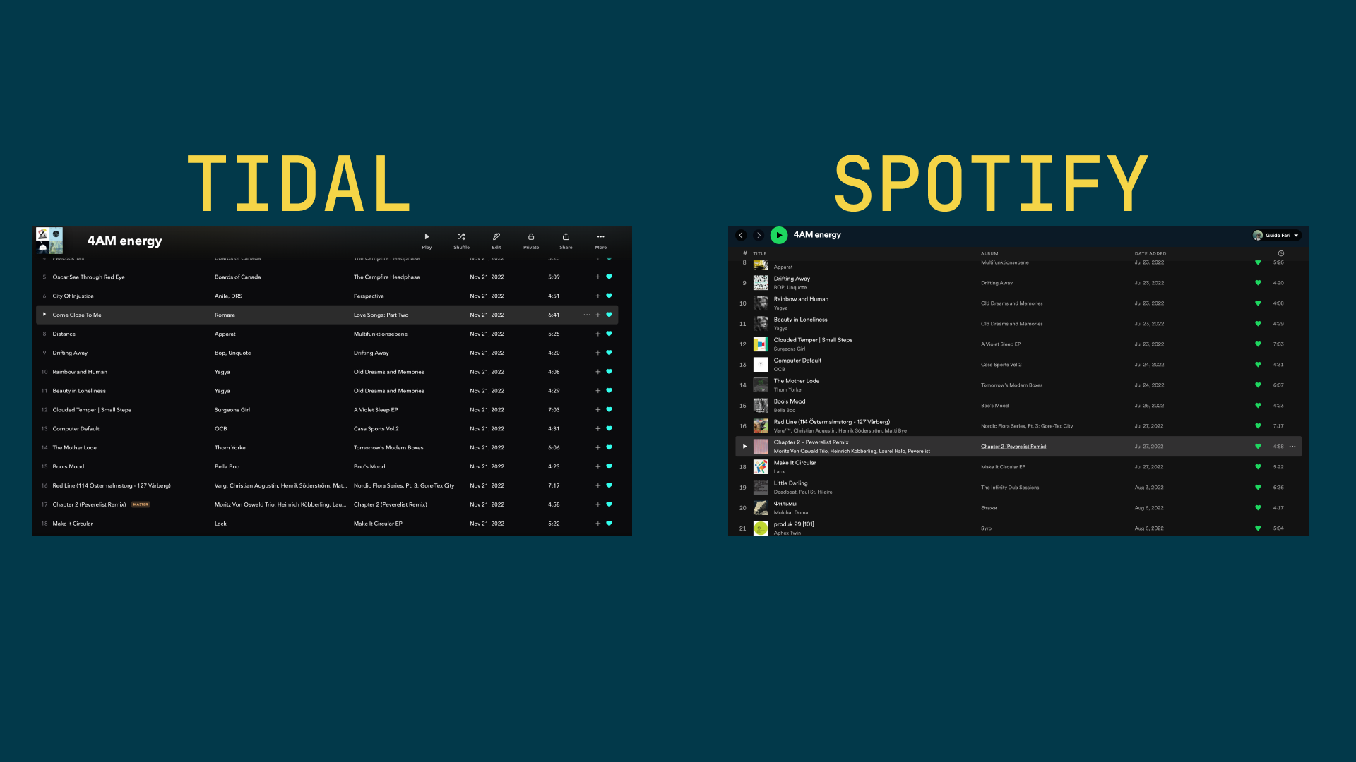
No Album cover on tracks in playlists

- Strangely, when viewing liked songs on tidal, they do have an album cover.
- Lack of an album art is bad because humans are visual creatures. Adding another sense (sight) allows you to sift through the playlists easier.
Touch as many of their senses as you can
From the book “Your Music and People by Derek Sivers”
- I think this principle can be applied to UI/UX design as well.
- Random example just came to mind, and illustrates the point: I remember that Josh Comeau’s site makes use of some sounds when interacting with it. Small thing, powerful imact. I digress, lol.
State of UI is too heavily reliant on network
- When you like a song, sometimes the UI doesn’t reflect it. If you press the like button again, the song gets removed from your collection! a frustrating experience.
- Highlighting the importance of idempotence. This would be an interesting problem to solve!
- Sometimes pressing the
3 dotsormoreicon, the UI completely freezes. Until the network request has been responded to, I assume. This only happens when in poor network conditions.
Search bar
- Hitting the keyboard shortcut will only take you to the search bar, it doesn’t automatically highlight the old contents of the search bar too.
- This often results in me having to press another keyboard shortcut to highlight all content before I start to type my text
- It’s somewhat common UX (or just muscle memory for me because of the apps I spend multiple hours in) for the text in the search bar to be highlighted when you focus on it, especially if that focus is achieved via keyboard shortcut.
Music Player when autoplay is off
- this one is more a bug than real UX concern
- when autoplay is turned off, the music player will have a loading icon, as if it’s looking for something next.
- This is expected behaviour when you’re still in your playlist, genuinely buffering (which can be seen at the end of a tracklist, when it’s transitioning into the auto generated playlist)
- Flagging it as a bug because it causes confusion. You have to manually check the status of your tracklist, as opposed to getting information at a glance.
- This is sort of related to the heuristic “recognition and recall in user interfaces”.